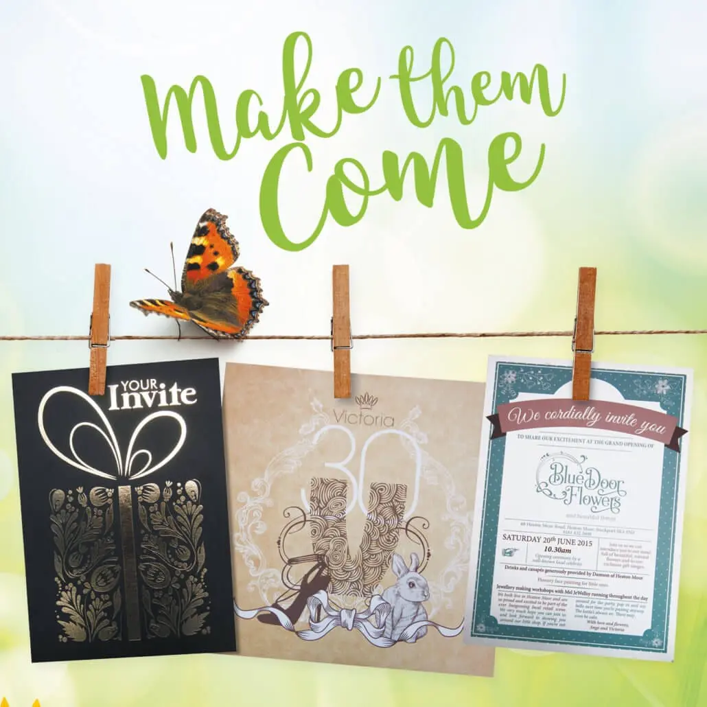
Are you planning any outdoor events this summer? Get maximum exposure for your brand with low-cost outdoor displays. Our 52-page Outdoor Display Ideas Look Book has loads of ideas for this year’s summer season. Get your free copy now!
What is User Experience and why should I care?
UI/UX has become a bit of a buzzword online lately. But user experience doesn’t apply solely to online. Far from it, UI/UX originates from the real world around us.
UX stands for User Experience, another term for customer experience really. Only ‘user’ is broader, as ‘customer’ implies the user has bought something (or is at least there to browse/buy).
“User experience” encompasses all aspects of the end-user’s interaction with the company, its services, and its products.
It is everything! When making a purchase from a bricks and mortar store, it’s:
- Advertising
- How easy it was to find the store
- Traffic and parking
- The shop
- Friendly, helpful staff
- Product range
- How easy it was to find what you wanted
- Pricing
- Product advice
- Queues at the checkout
- Whether the box fits in the car
- How easy the product was to assemble
- How easy the product was to use
- Aftersales service
We could go on.
In that sense, it’s a lot like branding. Some people think a brand is just a logo. But it’s much more than that.
Redefining online sales
In 1999, Zappos founder Tony Hsieh tackled the seemingly impossible – selling shoes online. After all, 20 years ago the preference was to try shoes on for size. Who is going to buy them online?
But now Zappos are one of the largest online shoe retailers in the world. How? By providing an etail experience that rivalled the traditional retail experience. They already had some advantages:
- A far larger range of footwear then your average store.
- The convenience shopping from home brings vs going into town.
By defining a whole new level of customer service (the stories of just how far they will go to make a customer happy are legendary), and offering a remarkable approach to returns (unlimited free delivery AND returns), they really changed the game.
So there’s a big difference between ‘User Experience’ as a whole and improving someone’s experience while on your website. Having said that, it’s a fundamental part that’s increasingly becoming one of the most important parts of the cycle.
So here is some website advice to help you get some quick UX wins on the board.
Easy peasy lemon squeezy
Everyone will tell you the site needs to be simple, and easy to use. That’s a given.
But this becomes even more important when your customer is using their phone. Mobile commerce now accounts for 36% of UK retail sales. And more people than ever are making bookings and reservations while on the go.
So the first thing to address when tackling ‘is it easy to use?’ is the mobile experience.
If the text is too small to read, the buttons and links too fiddly to click, then this needs to be fixed. If you have to pinch and zoom to find your way around then count yourself out.
A responsive website will reflow and resize the content so your happy shopper can thumb through the steps. No hassle, fuss or bother.
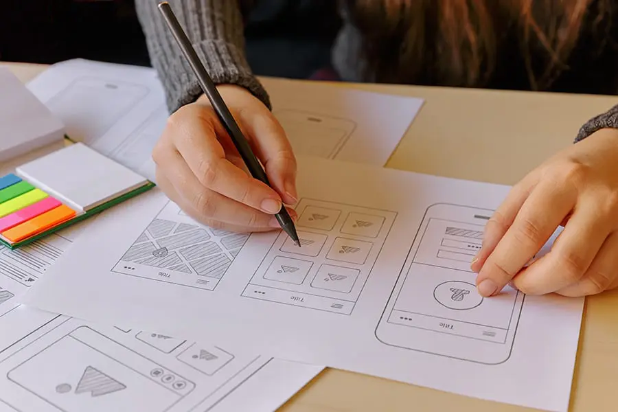
“Did you find everything you were looking for today?”
It should be easy to find what you’re looking for. That applies whether it’s the product you pine for or the data you desire.
Just like a good SEO strategy, your user experience journey starts by focusing on the needs of the user.
Giving the customers what they want is a pretty good idea in business, full stop. But how do you know what they want from your website? You can start in four very simple ways.
- Asking your customers
- Seeing what questions you receive from the website
- Checking user flow in analytics
- Studying search data with search analytics report
Combining this knowledge will give you great insights into user intent.
- Why are people visiting your website?
- What are they hoping to find?
- What are they looking to do?
This will not only enable you to deliver the right kind of content, but will also help you map out the journey through the website. ‘Findability’ isn’t just a search box, it’s about guided exploration.
Like VIP guests arriving on a Hawaiian island, visitors should be gently guided so that they can flow seamlessly through each phase. Flower necklaces, effortless check in, let us take your bags, there’s the watersports guy, cocktails at the bar.

Ecommerce experience tips
Following on from findability, almost equally as important in terms of ecommerce is getting customers over the line. Here are five easy ecommerce tips to help improve this aspect of the online customer experience.
1. Transparent Delivery Charges
When you’re in the supermarket with a basket of groceries, you don’t tend to pop it down on the floor and walk out. That would be a bit bonkers. But people do this online. All the time.
And the #1 reason for cart abandonment? Adding extra costs at checkout.
Be as transparent about your delivery charges as possible. If you offer free delivery over £xx then place this message site wide in a prominent position.
Getting this right will encourage people to actually spend more with you, rather than dropping their basket. Learn more about how to set out your online store.
2. Click & Collect
Customers like to know an item is in stock before leaving home. They also don’t like to wait (or pay) for delivery. This explains why Click & Collect has become so popular.
Across all major retailers, over half are already offering Click & Collect, with many more planning to add it this year.
According to Internet Retailing magazine, more than 60% of Click & Collect shoppers go on to purchase further products during item collection.
3. Wishlist
Life’s not always black and white. The reason someone might remove an item from their basket could be down to a number of things. Often, it’s not a cold hearted change of mind, but instead it’s just not the right time.
By offering the ability to save the item, or add to wishlist, you provide an alternative that’s mutually beneficial.
You make it easier for the customer to return and buy the item at a later date. (This is also an acceptable reason to ask that they make an account). You also create a more casual browsing experience as wishlists subconsciously require less commitment than an ‘add to basket’ action.
4. Easy checkout
As well as appearing credible, it’s essential to make it as easy as possible for your customers to complete their purchase.
Forcing people to fill in boxes with their details in order to buy something is a major conversion killer. Reminiscent of those 80’s department stores that required you to have an account before buying from them. Remember them? No? Exactly!
So one of the most significant improvements you can make is to allow customers to checkout without requiring an account. You can always give them the option to create an account afterwards.
5. Thank you, come again
After the payment has been processed, you should redirect your customers to a page thanking them for their purchase. But don’t stop there, improve the customer experience by providing helpful links such as
- What happens next
- Create an account
- Track my order
- Product recommendations
Or make the most of this opportunity to interact with an engaged customer:
- Make it easy for them to share their recent purchase on social media
- Ask them to review their experience
- Encourage newsletter signup or competition entry
- Offer a limited time voucher on their next purchase
The best websites are never finished
They are living, growing things that need to be continually reviewed, updated and improved. Ask about how our concierge packages can help you to define the ultimate user experiences for your customers.
Foiled stamped flyers create a striking impression – stand out and strengthen your brand credibility.
Nettl.com of Liverpool incorporating printing.com take a thick 400gsm board, apply an ultra smooth luxury matt laminate finish and top it off with metallic gold or silver foil highlights. If you want to make an amazing impression and to stand out with something really special, then our Opuleaf Luxe Foiled Showcards are for you. Contact us today for your free samples.
Local businesses across the country are fighting back against the internet by providing customer experiences that simply cannot be delivered online. Stand out from the crowd and GET OUT there today.
Be a great big brand strawberry. We’re all in business to attract attention and get picked. Right? The trick is making sure it’s us that customers want to pick. Find out how to get picked.
Getting the most from selling online
Part one: Merchandising your online store
As more and more people get in the e-commerce action it’s important to remember how it all started. Shops and stores showcased their products, built their reputation, looked after their customer base and spread the word.
Although as technology and behaviour changes, and a whopping £133bn a year is spent online, has the philosophy behind retail success really changed at all? Or have popular e-commerce stores taken the essence of what works on the high street and simply delivered these values online?
It may seem like a whole new ballgame but the principles of our offline shopping experience remain steadfast in our experiences online. Utilising these principles in the online world will help you get the most from your website:
- Merchandising your online store
- Credibility and trust
- Customer experience
- Making yourself known
Merchandising your online store
Seeing as your product is the star of the show, today we’re going to start with #1, merchandising your online store. Let’s begin by checking off some important tips to help you showcase your swag.
Real world example of e-commerce merchandising done well
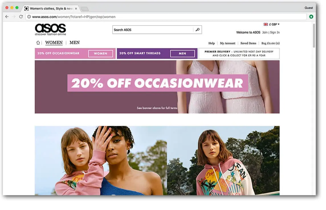 Online fashion retailer asos.com do pretty much everything right. The site is oozing with aspirational lifestyle images, detailed glamorous product images and cat walk videos.
On the one hand they face a significant challenge. After all, traditionally people like to browse a store and try clothes on. But on the other hand, they have the advantage of tapping into an emotive subject, fashion. Or even deeper, public perception and self image.
How important is photography to my webshop?

When you’re in a real shop, you see the item how it is. Not a small blurry version of it. Seeing is believing. So a lot of effort needs to go into reproducing that visual experience.
You’ve been on gumtree or eBay. The items with the best and most photos stand out. The ropey photos make you think twice. So it’s no surprise that e-commerce sites with great product images outperform ones without.
Good photography improves the perceived quality of your product, can communicate lifestyle values and increase how credible and trustworthy your site appears. We suggest you get a professional photographer to help. It’ll be a smart investment long term. You can use the photos in your marketing, as well as on your product pages.
We can arrange professional photography for you or make a local recommendation. However, if you do not have the budget available right now, you can always shoot the images yourself. Just be sure to consider your lighting and backdrop. Whether you’re using your smartphone or a decent camera, set up a mini studio. Use a tripod, lamp and studio tent. Aim for good light, contrast and consistency. No blurry images, kitchens, bathrooms or unrelated objects in sight!
What product descriptions work well?
Paint a picture. Quality product descriptions help get the sale over the line. They are also very useful for search engines. So your goal is to have words that not only describe the product, but go beyond that.
Sure, list the features, but what are the benefits?
What problem does the item solve? How does it make you feel?
The ‘feature’ of a toy product might be ‘batteries included’. The benefit is that the child can start playing with the toy straight away. Avoids the tears from disappointed littl’uns. Avoids frowning parents making an impromptu dash to the shops.
Tell stories about the product and use words that describe how it sounds, smells, feels, looks. These things will all help elicit an emotional response from the reader.
Scattered throughout this explanation should be a few choice keywords, for search reasons. But it’s important this sounds natural, like a real person would actually say it. No broken English or robotic sounding phrases – this will just put your buyer off.
When you walk around a shop, you don’t read every bit of information, it’s impossible. You scan for bitesize info that you can quickly act upon. This applies online too. So Use headlines, subheadings and bullet points within your description to make your text easier to pick out and absorb.
Does my e-commerce site need product reviews?

It helps, yes. Social proof. Just like in the real world, people are way more likely to believe what someone else has said about a product over what you’ve said yourself.
Especially if that someone has already bought and received the item. Did you know, 61% of customers read online reviews before making a purchase decision?
And if people are on the fence between a couple of options, they’re likely to go for the one with the most positive reviews. In fact, 50 or more reviews per product can lead to a 4.6 increase in sales.
What other information will help people buy?
It’s summer, you want to get fit and spend more time with the family. So find yourself meandering round a bicycle shop scouting for bikes for the family. It’s understandable that you might want some advice to help you decide what bikes suit you best.
Online, in the absence of a smiling sales assistant, your web shop needs to compensate by offering useful guides matched to expected customer queries.
In this instance, you’ll want to have content that explains what type of bike suits your usage, and especially a size guide. Content might be articles, illustrations or videos and could cover things like:
- FAQs,
- Size guides,
- Comparisons,
- Performance charts,
- Instructions,
- Assembly guides (if it’s simple!)
What type of video drives e-commerce sales?

Have you heard of the term ‘showrooming’? That’s where potential buyers peruse the high street shop to browse before hitting the internet to find the best deal online.
But reverse showrooming, or ‘webrooming’, occurs when customers browse online but head to a bricks and mortar shop to complete their purchase. There is an increased risk of this when your website either fails to provide enough information about the product. Or the consumers desire to see the product in action isn’t met.
There’s no better substitute for actually being there than video. Until AR/VR takes over then it’s the best thing we’ve got to demonstrate what the product looks like and how it’s used. Videos that showcase product dimensions, as well as product functionality tend to be really helpful.
Ultimately, it’s good to have video because tests show product videos help sell more.
What’s more,
- 71% of shoppers think video explains the product better
- 58% think companies with product videos are more trustworthy
It doesn’t have to be complicated or expensive. The videos on asos.com are simple but effective. They film the model wearing the clothes marching glamorously onto the set, ready to take the photos. Two birds, one stone.
As a guide shorter videos work best. But although reviews are generally a good thing, research has shown that videos of someone reviewing a product, tended to be a flop with the audience.
How can I design my website to upsell more products?

In stores, product placement is important. Items are often grouped together or advertised as a bundle. Coffee pods by the coffee machines, matching bathroom decor, a discount on shaving products with purchase of razor, that sort of thing.
Plus we are bombarded with last minute impulse buys. Whether it’s batteries by the conveyor belt or the friendly sales assistant on the till. How often have you been asked to consider something extra that you hadn’t originally put in your basket? We heard about one petrol station asking their customers if they’d be interested in the chewing gum deal. Possibly a bit rude. Gum, anyone?
But it works and that’s why they do it. Your website can do this even better, because it can offer a never-ending array of products to you, without getting annoying. Imagine someone at the checkout offering you one product after another, how annoying. And yet your website can display dozens of products throughout the customer journey. As you browse the pages, as you add items to your wishlist and basket, it can follow you around saying “Wow, great choice. Why not get this with it? Other customers bought them together you know.”
What makes an effective webshop category page?
Supermarkets and department stores organise their goods into sections, aisles and departments, so shoppers can make better sense of it all. It helps people find what they want quickly, immerses them in a relevant environment, and adds an element of control to the customer journey.
This is where your category pages come in. They add structure, navigation, enjoyment and momentum to the shoppers journey.
Good category pages will introduce shoppers to subcategories, holding their hand through the journey and guiding them effortlessly to the products they are looking for.
Make sure you use enticing images and descriptions. They will be useful and reassuring for your visitors and also a great place to put your key search terms, ready for those googlebots to find.
Include a customer service bar at the top to build trust. This section could feature a phone number, free delivery message and hassle free returns badge. Don’t overload it with too much info, just enough to reassure the buyer and nudge them along.
How can I keep on top of stock control?
High street stores have limited space. Efficient stock control is the key to having the right amount of stock in the right place, maximising the opportunity for sales.
Most ecommerce platforms have systems in place to help you stay in control of stock levels. But what if you have a physical shop too? How can your till, website, and inventory software keep talking to maintain a healthy stress-free relationship?
If you have an epos now or datasym system, we can help connect your website to your epos equipment and automatically synchronise stock levels between your web shop and your retail stock.
- We’ll import your products from your system
- Review products, add images and detailed descriptions
- Sync your stock levels automatically
- When you sell an item, the stock on your till is automatically updated
- Get paid into your merchant account and process the order
- Despatch or allow ‘click and collect’ and send email notifications to clients
Contact your local studio to get started.
So you see, the values embedded in successful bricks and mortar retail can be harnessed to great effect online, where the potential for sales is greater.
Hope you found part one useful. Coming next, part two, building trust.
But for now, in the words of retail, ‘Thanks, please come again’.
Nettl now: Same day printing, delivered FREE in 4 hours
We’re pleased to announce the launch of Nettl now this week.
Our solution to your on-demand print needs.
Nettl now offers a range of popular print products, delivered direct to you for free, in as little as 4 hours. You can order anything from one poster to a few hundred flyers. The service was created in response to client demand. Our studios tell us they are constantly being asked to help with last minute jobs and get clients out of a pickle.
The rapid turnaround is the perfect tonic for when print is needed urgently. Perhaps:
- You’ve been let down by another printer,
- Someone forgot to order,
- You’ve spotted a last minute event opportunity,
Clients place their order online at www.nettlnow.com, upload their print file and then choose a delivery slot, starting within 4 hours. Their order is then printed, packed and delivered that day by dedicated bike or van.
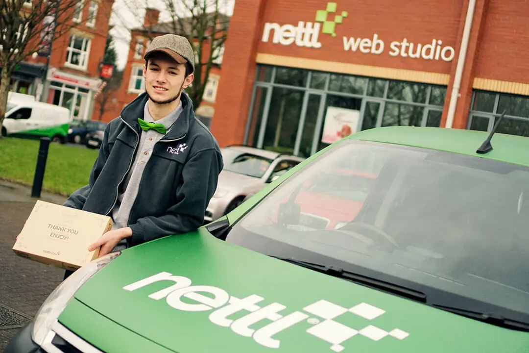
Our pilot service is available in Manchester right now, and following a successful trial period will be rolled out to a further 10 locations and beyond, with plans to offer Nettl now in all major cities across the UK.
Free delivery with Nettl Now is available in the following Manchester postcodes now: M1, M2, M3, M4, M5, M6, M7, M13, M14, M15, M16, M17, M21, M27, M30, M32, M33, M41 and M50. The service covers the city centre, Ardwick, Ancoats, Blackfriars, Brooklands, Castlefield, Chorlton-cum-Hardy, Chorlton-on-Medlock, Clifton, Davyhulme, Deansgate, Flixton, Greengate, Hulme, Fallowfield, Ladybarn, Longsight, Manchester Science Park, Media City, Moss Side, Northern Quarter, Old Trafford, Piccadilly, Pendlebury, Rusholme, Trafford Park, Sale, Salford Quays, Stetford, Swinton, University, Urmston, Wardley and Whalley Range.
Become a Nettl Nowmaker
Does your business make digital print or posters? Register to find out more about becoming a Nettl Nowmaker,
Top 6 tips to get more web enquiries and grow your client list
People are busy and easily distracted. So how do you encourage visitors to stay a bit longer on your website, find what they need, and get in touch easily? Ultimately, how can you convert your web traffic into web enquiries?
There’s no magic formula, but research has shown these simple steps can help:
- Be clear about what you’re offering
- Write for the web
- Make it easy to get in touch
- Build trust and credibility
- Be mobile friendly
- Keep it up to date
1. Be Clear About What You’re Offering

When someone arrives on your site, you don’t have a lot of time. You need to make it clear who you are, what you offer, and what do I need to do to take action?
Headlines and straplines are incredibly important. That’s because, in very few words, they give you the opportunity to summarise what the company, website or page is all about.
As well as words, you can use images, icons and video to communicate your message effectively.
A great example of this is Dropbox’s homepage. The snippet of text clearly says “Get to all of your files from anywhere, on any device, and share them with anyone.”
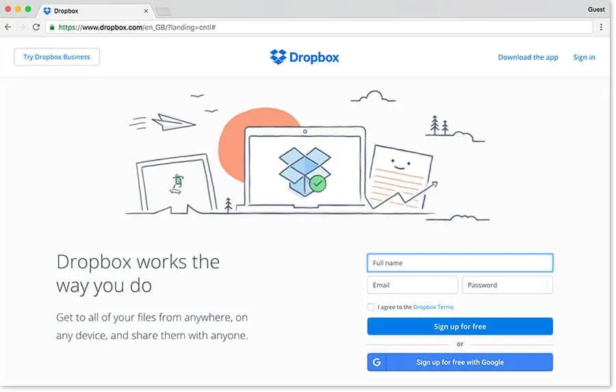
There you go. That’s exactly what they can do for you. In one sentence. And to complete this fabulous landing page, a very simple form. You know exactly what you need to do next. Apply this simple approach to your website and you’re sure to increase web enquiries.
2. Write for the Web
People read differently on the web. They tend to scan and pick up snippets.
Typically, users read less than 30% of the page, and this is mostly the top section and headings. Attention declines dramatically as they move down the page. So it’s a good idea to put the most important information first and get your message across in the headings.
By getting a clear, unified message through to your audience, you stand a much better chance of communicating value and purpose, which will in turn encourage more web enquiries.
In general, it’s best to use simple language. Avoid jargon and complicated terms. Government advice regarding writing for web suggests people prefer to read information in plain English ‘because it allows them to understand the information as quickly as possible’. Writing in CAPITAL LETTERS is more difficult to read. It also looks a bit shouty, so should be avoided anyway.
- Make the text easier to read by using:
- Short sentences
- Sub headings
- Bullet points
- Highlighted keywords
3. Make it Easy to Get in Touch

This one sounds obvious but it’s often overlooked. Typically, the 2nd highest visited page, other then the main homepage, is the contact page. People are searching for your business online, just so they can get in touch.
So to boost your web enquiries, give them what they want, nice and early. Consider putting your phone number in the header. Make sure the footer has your phone number and email details.
If you have a business where the location is important, like a hotel, shop or restaurant for instance, then make a big effort to clearly show where you are and how to find you.
A clear CTA (Call To Action) should exist at the bottom of each page. There’s potential for multiple CTA’s throughout the page at different sections. The goal is to make it very clear what the visitor needs to do next. This could be anything as simple as a
- Telephone number
- Email Address
- Contact form
- Link to social media
- Button to apply/register/download/read more
Consider adding a live chat feature to encourage engagement. Although we’d only advise this if you have the resources. At least one person needs to be available to monitor and respond to the enquiries. An idle chat can look understaffed and have a detrimental effect.
4. Build Trust and Credibility

Building trust is especially important for businesses that sell online. Customers will want to feel an extra level of reassurance. After all, there’s an element of the unknown about the internet. You want to feel safe handing over your payment details. You want to feel confident nan’s present is going to arrive on time.
But for websites that don’t sell, credibility is still often the primary objective. That’s the case for most brochure websites. Visitors typically arrive for the first time, usually after hearing about the company in some way.
This may have been through personal contact, recommendation, online search or a piece of marketing literature. Visitors will be looking for indications that the company is professional and able to deliver on it’s promises.
People like to do a little digging.
Here are 5 ways to help boost your credibility and increase web enquiries:
Get an SSL Certificate
Having an SSL certificate on your site means the data passed between your site and your visitor is secure. SSL helps you gain trust from potential customers and makes you look more professional. Your local studio can help you buy and setup SSL.
Look the Part
Professional design and well written copy is of paramount importance. Even subliminally, good design will go a long way towards the perception of your brand. By association, if the website is high quality, your product or service is high quality. SEO expert, Rand Fishkin of moz.com believes ‘Design isn’t just important, it’s 50% of the battle’.
Use Testimonials and Accreditations
People are far more likely to believe what someone else has said about your business than what you say yourself. It’s human nature. So combine great design with industry accreditations, and social proof.
Use testimonials as a powerful way to say how great you are. Work them into relevant case studies to demonstrate your capability. This will really cement your credibility and encourage users to take the next step with confidence.
Allow Visitors to ‘Meet the Team’
Our experience tells us that ‘meet the team’ pages are very popular destinations. Typically only falling behind the home page and contact page in terms of visits. It’s easy to see why, people like doing business with people.
Publish a Blog
Another popular hotspot for visitors are blogs or latest news sections. Not only does a fresh, relevant blog keep Google happy, it also helps position your company as experts in your field.
5. Be Mobile Friendly

Or perhaps even ‘Mobile First’. That means designing your site primarily with your phone user in mind. Sure, it has to look great on a desktop too, but with more and more people browsing on their phones these days, considering their needs first would not be a bad thing.
Think about it, if you’re checking the web on the go, you don’t want to struggle to do what you want to do. Encourage mobile web enquiries by making things quick and simple to do on a phone.
People are often ‘quickly’ doing something on their phone, while they’re doing something else. Quickly sign up for this, quickly pay that bill, quickly book a table… If your website doesn’t support ‘quickly’ then you’ll quickly be shown the door.
Things to watch out for are:
- Text too small to read
- Buttons too small to click
- Forms too tricky to navigate
- Hefty images and downloads
If you have to pinch and zoom to work your way around the site, time to change, speak to one of our Nettl Web Studios.
6. Keep Your Website Up To Date

Google likes fresh, new, relevant content, but so do real people! Sure, a lively blog will help your search engine rankings but it will also indicate that you’re an active business on top of it’s game. Frequent updates will encourage users to come back for more, it can help position you as an expert in your field, and it will create the confidence that leads to web enquiries.
We mentioned trust earlier. It’s important to keep on top of updates to maintain credibility. You don’t want your site to look like you’ve gone for lunch and not come back.
If a feature has stopped working, if the footer still says 2015, if the blog section has gathered dust and the social media feed is more #london2012 than #pyeonchang2018, a bit of tender loving care is needed to avoid putting people off.
A well maintained website is also necessary for security. If you need a hand keeping on top of things, just ask us about our concierge service.
> We Can Help
Web traffic is great but website enquiries are better. Use the advice above to convert your browsers into business opportunities.
There’s a lot to think about, but we’re here to help. Call or pop into your local studio for advice on how to make your website work harder.
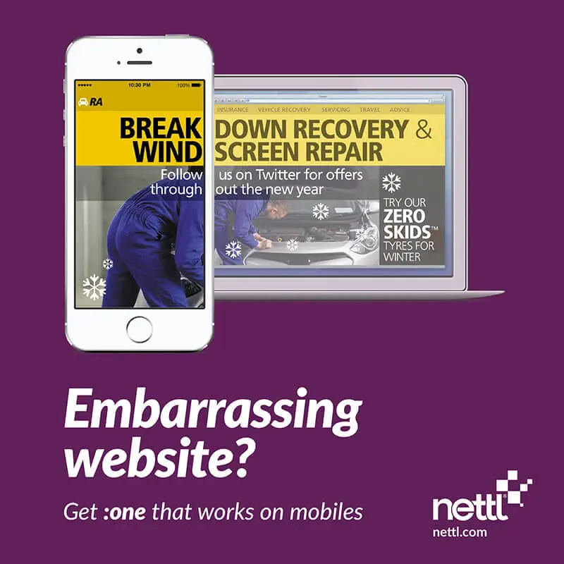
Maybe your website isn’t as embarrassing as The RA, but how easy is it to navigate on your mobile? Do you need to pinch and zoom and pan and scale? If you do, then so do your visitors. And that’s awkward. It could be losing you business.
Take a look at your site now on your phone. Now look at your competitor’s. Is your site easy to navigate? Is theirs?
We crossed a tipping point last month. According to research from Capgemini, 52% of visits are now from mobiles or tablets. If your site isn’t built with mobile in mind, you risk turning away customers. With a Nettl :one site, get a website that works on mobile, tablet and desktop in one.
Nettl is now open in Manchester, Birmingham, London and Dublin. We build elegant websites and webshops. Want to add online bookings or reservations? Or want to sell online? We can help. Pop-in or call us to book a free consultation and we’ll show you how to get started.
Today, is a sad day, because we’ve reached the final font in our Free Font Friday giveaway!
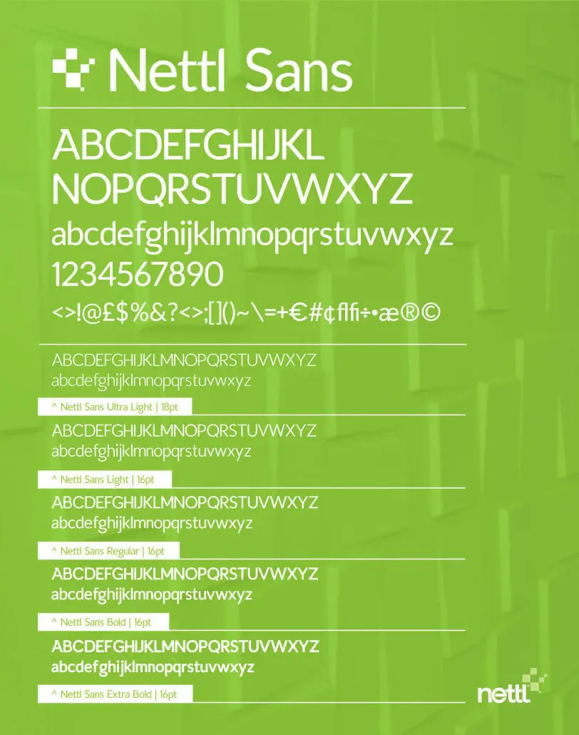
But, it’s also a good day, because we’ve saved the best free font for last! Nettl Sans is the Crown Jewels of our font collection. We loved it so much, we decided it should have a catchy name that everyone will remember!
Use Nettl Sans however you’d like, it’s completely free of charge and can be used for your in-house stuff as well as for clients commercial work.
Give it a download and try, you know you want to! We’ve attached this brand new free font in OpenType (OTF) format for use on your Mac or PC as well as it also includes webfonts in TTF, SVG, EOT and WOFF formats, suitable for use on your website. We’re a little emotional our new font is ready to be released into the wild, but you can help make it easier for us by sharing this with your friends, family and countrymen on Facebook, Twitter, Google Plus or whatever. Nettl Sans is yours to use however you like. So feel free to pop it on a poster, lay it out on a leaflet, drop it on a door hanger or erm… wow with it on a website for yourself or a client. It’s free… forever.
We like to do this sort of thing for our friends, we’re nice like that. We also usually get the first round in the pub or offer to sing the first song at karaoke. So go on, use the free font Nettl Sans, and when you do, think of us.
This is the last free font for now, but we’ll be back with other free goodies soon!
Nettl Sans is licenced under the Creative Commons Attribution v3.0 Licence which allows you to use it for any purpose, even commercially.


